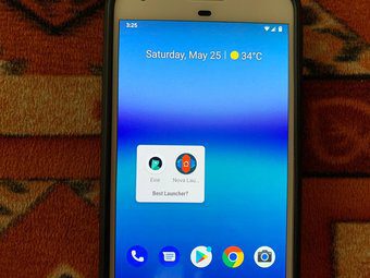
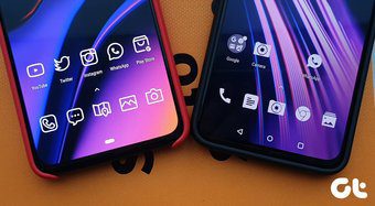
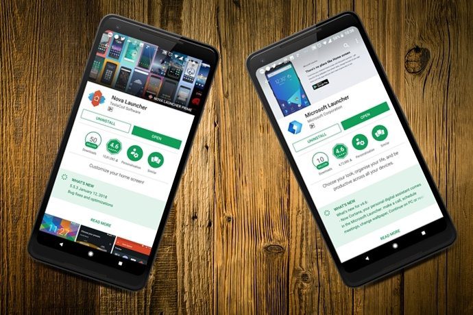
Many great launchers are available on the Play Store. The developers keep on adding features to these launchers. We decided to check the Microsoft and Evie Launcher. Here, you will find the comparison between these two.
App Size
Surprisingly, there is a major difference between the app size of these two apps. The Evie Launcher is almost half of the Microsoft Launcher. While it weighs 6.8MB, the Microsoft Launcher has size of 17MB. Download Microsoft Launcher Download Evie Launcher
Import Home Screen
Not an issue for many, but if you use multiple launchers, you are going to miss the import home screen feature in the Evie Launcher. When you open the app for the first time, both these apps ask you that if you want to import home screen from any other launcher. But, if you somehow missed that screen or you want to import from a different launcher, you would have to uninstall and reinstall the Evie Launcher to do so. Thankfully, the Microsoft Launcher lets you import home screen any time from the settings. Also, in case you are wondering, both the apps let you backup and restore your current home screen setup and other launcher settings.
Theme Support
Very few launchers support themes and Microsoft Launcher is one of them. It comes with themes for everyone. You get light, dark, and transparent themes. Sadly, as of now, you will have to live with the light theme in the Evie Launcher.
App Drawer
If your phone’s native launcher doesn’t support app drawer, you are in luck. Both these launchers support app drawers. For the unaware, an app drawer is the additional screen that contains all your app icons. Unlike home screen, where you can add or remove icons, app drawer lists all app icons. But, do we need an app drawer? Read this to find out the answer. There are some differences in the app drawer of both these apps. While Microsoft offers two layouts – vertical and horizontal, the Evie Launcher supports only vertical layout. It, however, lets you choose from grid or list layout type for vertical scroll.
Folder Customization
Both the apps support folders on the home screen. But you can also create folders in the Microsoft Launcher app drawer. On the other hand, Evie Launcher doesn’t support folders in the app drawer. However, when it comes to customization, the Evie Launcher offers more customization options. Besides letting you change the icon shape, you can also change the number of columns and icon size of folder items. The Microsoft Launcher only lets you change the icon shape. Further, both the apps lets you hide the dock.
Animations and Gestures
When it comes to gestures, the Microsoft Launcher offers a whole bunch of them. These include swipe up, swipe down, two fingers swipe up, double tap, pinch etc. You can link shortcuts, apps, and launcher features to these gestures. Talking about gestures, check these cool hidden Android gestures. On the other hand, the Evie Launcher has limited gesture support. You get only three gestures – a two fingers swipe up for Google Now, double tap to lock, and home button to search. It also has a native support for swipe down gesture on the home screen that launches search.
Quick Search
Both the launchers come with a powerful search. You can use the search to look for apps, system settings, and contacts in these apps. Similarly, you can also search online directly from these apps. However, while the Microsoft Launcher supports document and SMS search, the Evie Launcher lacks the same. Further, you can change the order of search results in the Microsoft Launcher. For instance, if you want contacts to display first followed by apps and settings, you can reorder them in the Microsoft Launcher settings. This feature is not available in the Evie Launcher. Also, in the Microsoft launcher, the search bar is at the bottom, while in the Evie Launcher it’s at the top.
Unread Notification Count
While both the apps support unread notification count, the Evie Launcher is a step ahead. Why, you ask? Well, because it offers extra features as compared to the Microsoft Launcher. You can change the badge style from count to dots and also change the size of the unread notification label. Further, you can disable the apps if you don’t want to receive its notification count. None of these features are present in the Microsoft Launcher. You only get simple unread count badges.
Personalized Feed
The Microsoft Launcher comes with a personalized feed that is not present in any other launcher. When you swipe right on the home screen, you get this feed. The feed lists your most important contacts, shows you news, calendar and recent activity. It also comes with a native notes and a to-do list feature. You also get a hidden Continue on PC option. The Evie Launcher doesn’t support these features.
Other Customization Features
Apart from the above-mentioned features, both the apps have similar customization features. You can customize the number of columns, rows, and icon size. You can even easily change icon packs from these launchers. Both the apps let you hide apps and lock home screen layout. You can even hide app labels. However, I personally like the uncluttered settings in the Evie Launcher. The settings are easily accessible and not buried too deep.
Do We Have a Winner?
Both the apps have distinct features that make them special. On the other hand, they are also similar in terms of many features such as the home screen customization features. You should try both these apps as they make good Nova Launcher alternatives too. Customize each app according to your wish and let us know which one do you like the most. The above article may contain affiliate links which help support Guiding Tech. However, it does not affect our editorial integrity. The content remains unbiased and authentic.


